Docol
Docol is one of the main brands of accessories for bathrooms and kitchens.
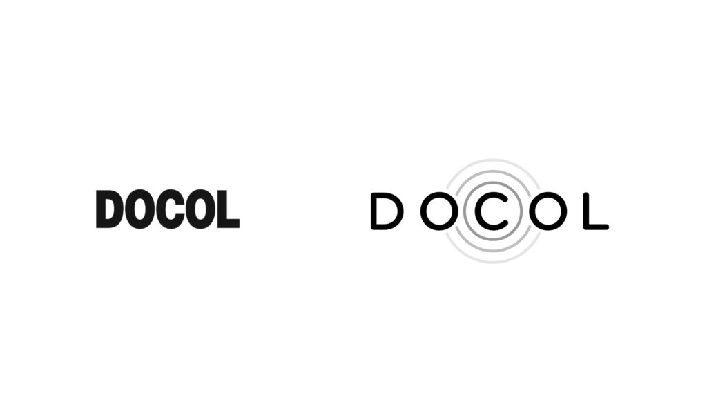
I proposed a redesign of the Docol brand. Even though the client chose to pause the project at the time, I really liked the process and the result.


The current logo has bold lines. I think it worked in the past where the brand wanted to convey an image of durability. Today it has proven that and now it can update itself, improving the message. The idea of a lighter and more which suggests movement when using a ripple effect as a figure.


Docol Chroma.
I designed the Chroma logo, the technology from Docol, responsible for coloring the metal parts. During the painting process it is possible to see millions and zillions of blue micro dots coloring the piece.


